dollarwise brand refresh
brand | art direction | designChallenge: Dollarwise’s brand had passed through contractor after contractor, with guidelines becoming less cohesive with each handoff. Engineering made it’s own UI decisions for the app, so the site and core brand and the app felt like different companies.
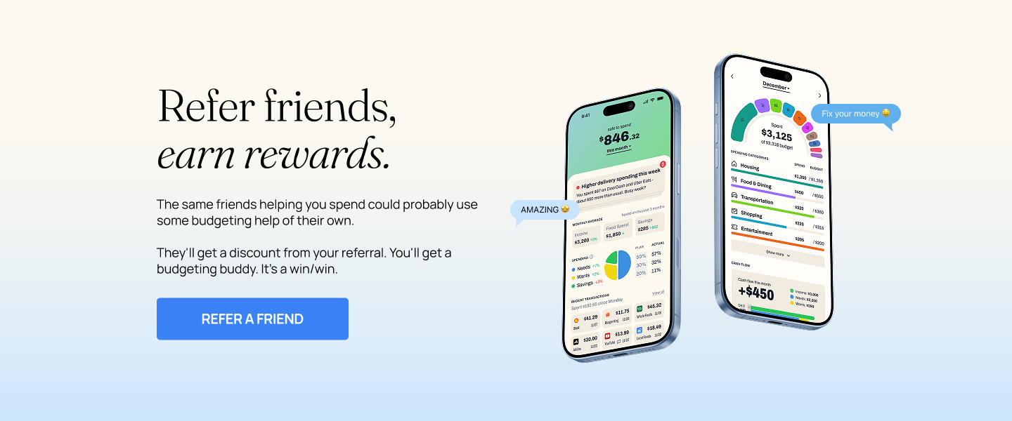
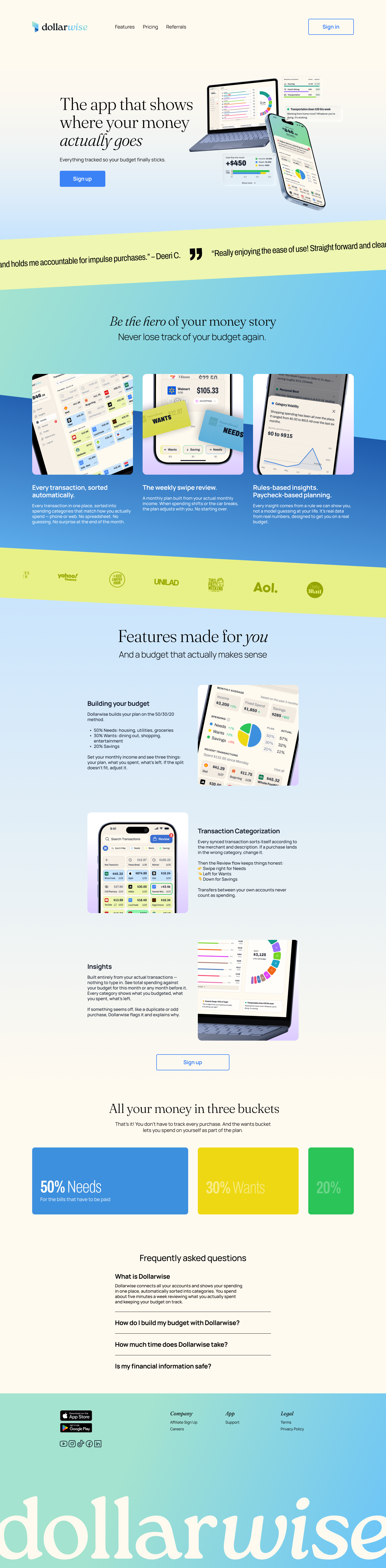
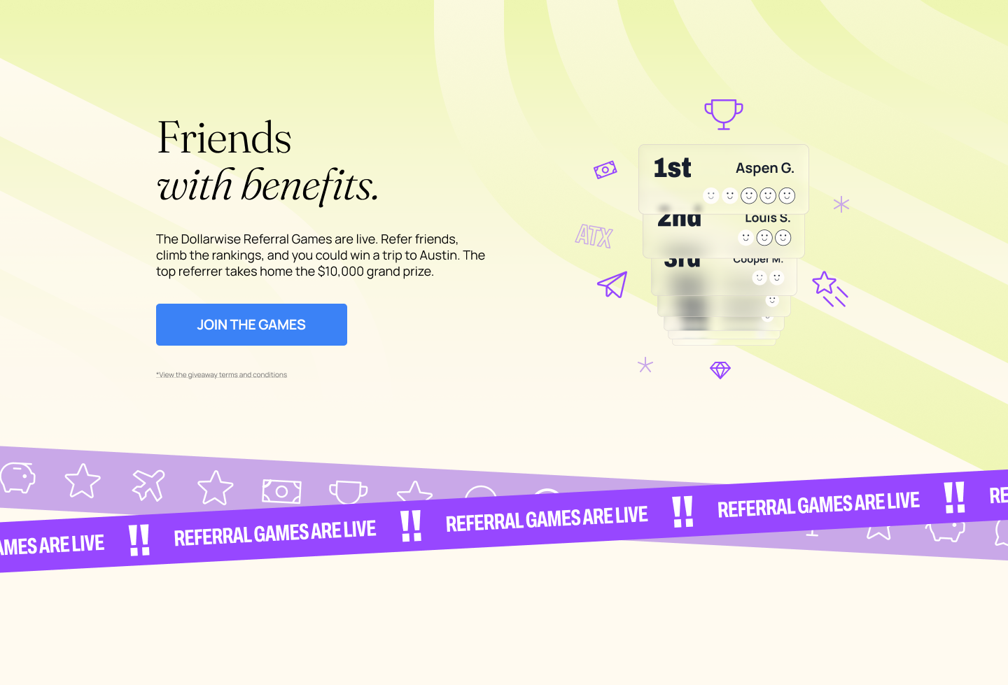
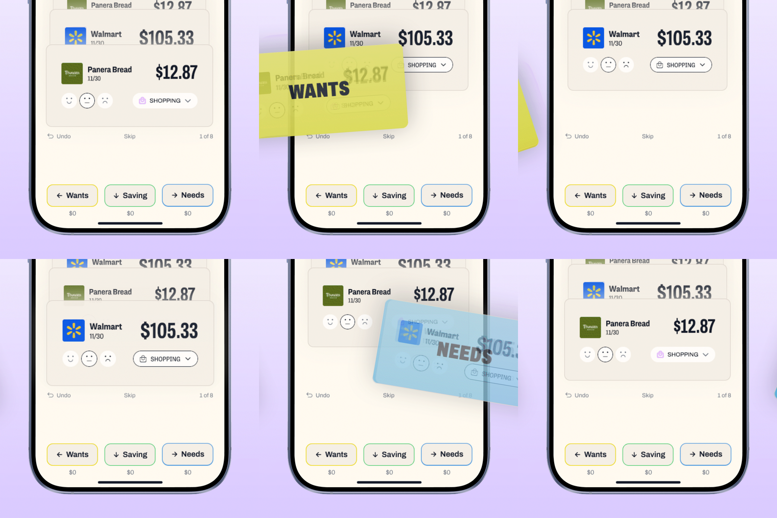
Idea: I bridged the gap instead of starting over. I carried the app’s bright greens, blues, and purples into the brand and made color carry meaning: blue for needs, yellow for wants, green for savings, every time. I modernized the brand serif with a lighter weight and tighter kerning, and set every number in the app’s punchier block sans.
My role: Brand steward and creative director for Dollarwise, from guidelines to the website redesign.
Result: Higher brand awareness and churn down 2% on average MoM.
Photographer: Ethan Tran